Created to resemble the blockiness and interlocking mechanics of concrete bin blocks, this icon is both recognizable and influential, while maintaining a simple appearance.
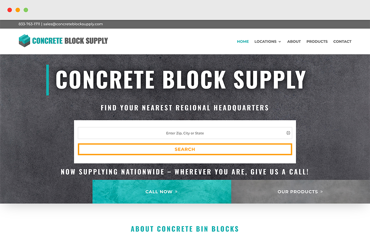
For darker backgrounds, such as certain sections on their website, a white logo was needed to create contrast and allow the logo to be seen clearly.
A shorter logo is a must-have for companies who want the flexibility to place their logo anywhere.
This inline version can fit comfortably in slim spaces, such as web headers or printed labels.
The compliment of Concrete Block Supply’s branding teal color is a nice construction orange.
The orange is too harsh to have played a large part in the website or logo, so the teal was chosen to be their main branding color.
Teal
The teal is easy on the eyes, and thus hard to over-use.
Orange
Keeping the orange as a compliment for highlights and pops of color was an important part of building the website.
Gray
Their gray color allows the opportunity to carry the branding colors into the text world. Creating large blocks of text that are easy to read. This shade of gray creates a perfect contrast with both the teal and orange colors.
Surprisingly, the logo was not rendered using 3D software. It’s a purely mathematical sketch, ensuring perfect angles, shadows, and spacing.
The white version of the icon wasn’t as straightforward as it may seem.
The logo needed to be fully recreated from the ground up, to allow for the lines of negative space that give the white block its shape.


